If you’re old enough to have been using the web in the 1990s (ulp, public admissions of age!), you may remember that web design was, erm, different from today. Actually, I think the word “design” there is somewhat generous.
Along with “Under construction” signs and hit counters, one of the more popular features of a web site was a really ugly background. The most common way to do this was simply a small image that was tiled over the page’s background. These were usually chosen to make the foreground text as hard as possible to read (or that’s how it seemed). To pick one random, but quite typical example…
(Taken from 10 Popular Web Designs From The 90s That Would Never Fly Today, example #2.)
Here is another delightful example…
(Taken from 15 Classic 90s Website Designs you Want Know, example #13.)
Thankfully we’re well past those days. Well, we were until my son decided to play around with some CSS! He was experimenting with background gradients, seeing what he could do in pure CSS. By combining two linear gradients and a radial one, he managed to come up with a single CSS rule that produced this monstrosity…
This is from someone who was in nappies when the previous backgrounds were released.
If you are daft enough to want to try this yourself (go on, admit it), here is a simple bit of HTML…
<div class="ugly1"></div>
…and here is the CSS..
<style>
.ugly1 {
  background: radial-gradient(#a400ff 0, #3b3b3b 10%, #d6d2d200 15%, #0b243a 50%, #d6d2d2 65%, #26483f 80%, #d6d2d200 95%),
              repeating-linear-gradient(45deg, #a78b4178, #a548a07a 50px),
              repeating-linear-gradient(135deg, #634610, #71b737 50px);
  width: 500px;
  height: 500px;
}
</style>
It actually looks a whole lot better (or worse, depending on your point of view) if you apply the CSS to the body of the page, instead of a single <div>, but I couldn’t bring myself to subject you to that!
Always one to rise to a challenge, I decided to see if I could beat him to it. See, there was one thing worse than those ugly backgrounds, and that was animated GIFs. Again, some of you won’t be old enough to remember these, but before we had PNG and SVG, we only really had two choices for web graphics. JPG images were fine for photos, but for computer-generated images. GIFs were the way to go, and were used (abused?) all over the place. Those disgusting background images you see above were almost certainly GIF images.
Now GIFs themselves weren’t necessarily a bad thing (other than the fact that Unisys decided they had a patent on them, and threatened to sue anyone who used them, which led to their replacement with the superior PNG format), but they did have one, erm, feature that made them really nasty. You could animate them. Yup, if you wanted dancing hamsters on your web site, animated GIFs were the way to go.
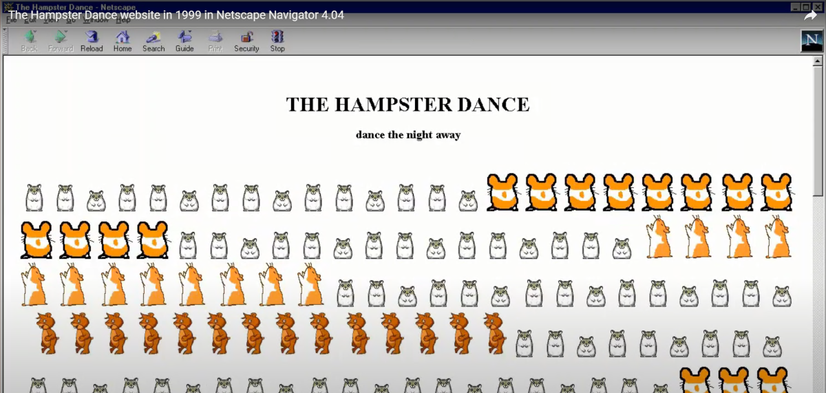
By the way, in case you think that comment about the hamsters was a joke, it wasn’t. One of the most popular web sites of the late 90s, partly due to the extremely catch tune, was the Hampster Dance (yes, she did spell “hamster” wrong). Although the site is sadly no longer available, you can see how it looked in Netscape Navigator (main rival to Internet Explorer, and the origins of Firefox) in this video.
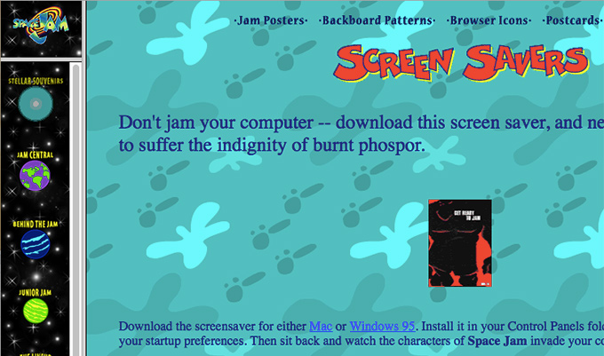
Well, this gave those dee-ziners an excuse to take ugly to previously unseen levels. Here is a lovely example, again from 10 Popular Web Designs From The 90s That Would Never Fly Today, example #6…
Yes, that was a real web site! It wasn’t an oddity either, the web was full of them in those days. It was a real Wild West Web, chock full of appallingly badly designed sites.
Ah, makes you want to put on a pair of flared jeans and grow your hair long doesn’t it? Oh wait, that was the 1970s! I’m really showing my age now!
Anyway, inspired (or disgusted) by the memories of those ugly backgrounds, I decided to, erm, improve my son’s jazzy design.
Staying within his CSS-only idea, I decided to try applying some animation to the background. This seemed simple enough, just add a couple of keyframes and we’re done, right? Erm, no. Turns out you can’t animate gradients, mainly because they are actually background images, and there is no way to animate one image into another.
OK, I an just hear the objections. Of course you can animate one image into another, PowerPoint has been doing this for decades. Even JavaScript can do this, as you can see from the many slideshows around. However, for whatever reason (possibly because it’s a messy waste of CPU), the people who behind the CSS specification didn’t include it. If you try it, you’ll find it just jumps from the one frame to the other.
However, not to be discouraged from my totally pointless enjoyment, I fired up LinqPad (my answer to pretty much everything) and wrote a quick script that generated the intermediate frames…
Enumerable.Range(0, 11)
  .Select(n => $"{n * 10}% {{ background: radial-gradient(#a400ff 0, #3b3b3b {10 + n}%, #d6d2d200 {15 + n}%, #0b243a {50 - n}%, #d6d2d2 {65 - n}%, #26483f {80 - n}%, #d6d2d200 95%), repeating-linear-gradient({45 + n}deg, #a78b4178, #a548a07a 50px), repeating-linear-gradient({135 - n}deg, #634610, #71b737 50px); }}")
It’s a bit long, but all it is is the single CSS rule he had, with the percentage values varying. This produced enough keyframes to simulate smooth animation.
Here it is in all its ugly glory, along with some very 1990s over-sized bright red text…
I did think about going the whole hog, and adding some JavaScript to capture the mouse right-click, in a pathetic attempt to stop you viewing the source (well, you can’t let anyone see how you did those hideous effects can you?), which was all-too common in those days, but as anyone with any experience will know, this never worked, as your browser had a View -> Source menu that did the same, bypassing the JavaScript. Still, it’s amazing how many people thought their badly-written abomination of HTML was worth the failed attempt of protection.
Ah, the youngsters today will never know what a wild world they missed!
Be First to Comment